News & Article

Day: June 28, 2026

Mascot Logo or Traditional Logo?
Branding
Mascot Logo vs Traditional Logo: Which Is Better for Your Business?

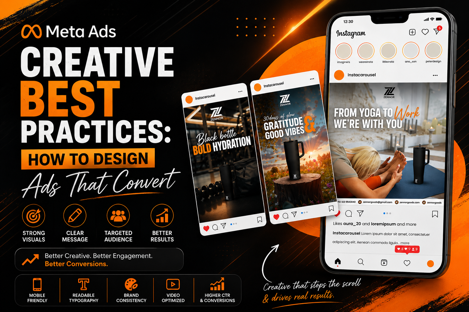
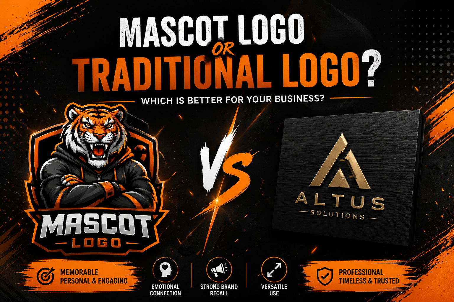
Choosing the right logo is one of the most important branding decisions you’ll make for your business. Your logo appears on your website, social media profiles, business cards, packaging, advertisements, invoices, company profile, and every other customer touchpoint. It becomes the visual symbol people associate with your brand. But when it comes to logo design, business owners often face an important question: Should I choose a mascot logo or a traditional logo? Both styles have their strengths, and the right choice depends on your industry, target audience, brand personality, and long-term marketing goals. A law firm, for example, usually benefits from a clean, professional wordmark or emblem, while a restaurant, gaming brand, or children’s business may achieve stronger recognition with a custom mascot character. Choosing the wrong style can make your business blend in with competitors—or worse, send the wrong message to potential customers. In this guide, we’ll compare mascot logos vs traditional logos, explore the advantages and disadvantages of each, and help you decide which style best represents your business. Whether you’re launching a startup or refreshing an established brand, this guide will help you make a more informed branding decision. What Is a Traditional Logo? A traditional logo is a visual identity built around typography, symbols, icons, or abstract shapes. Rather than relying on an illustrated character, traditional logos focus on simplicity, readability, and timeless design. The most common traditional logo styles include: These logos are designed to be versatile and easy to recognize across both digital and print media. You’ll often see traditional logos used by: Because of their simplicity, traditional logos scale well across websites, mobile apps, packaging, uniforms, signage, and promotional materials. Many of the world’s most recognizable brands use traditional logos because they remain effective for decades without requiring major redesigns. What Is a Mascot Logo? A mascot logo combines branding with character design. Instead of representing a business through typography or symbols alone, it introduces a unique illustrated character that becomes the face of the brand. That character could be: Unlike traditional logos, mascot logos create an emotional connection by giving customers a personality they can recognize and remember. A professionally designed mascot doesn’t just function as a logo—it becomes a complete branding asset that can be used across: Businesses that depend on customer engagement often benefit from mascot branding because characters naturally attract attention and improve memorability. Mascot Logo vs Traditional Logo: At a Glance Before diving deeper, here’s a quick comparison. Feature Mascot Logo Traditional Logo Brand Personality High Moderate Memorability Excellent Good Professional Appearance Depends on industry Excellent Emotional Connection Strong Moderate Scalability Good Excellent Merchandise Potential Excellent Moderate Social Media Engagement Excellent Good Corporate Suitability Limited Excellent Children’s Brands Excellent Moderate Gaming & Esports Excellent Good Luxury Businesses Limited Excellent While both logo styles can be highly effective, they achieve different branding objectives. The best choice depends on what your business wants customers to feel when they interact with your brand. Why Your Logo Choice Impacts Your Brand Your logo does much more than identify your business. It influences how customers perceive your professionalism, personality, and credibility within seconds of seeing it. A well-designed logo helps your business: That’s why choosing between a mascot logo and a traditional logo should never be based solely on personal preference. Instead, your decision should align with your business goals, target audience, and the type of relationship you want to build with customers. When Should You Choose a Mascot Logo? A mascot logo is ideal when your business wants to feel approachable, memorable, and engaging. It’s particularly effective for brands that communicate directly with consumers and rely on strong visual recognition. A mascot logo is an excellent choice for: A custom mascot gives your business a recognizable personality that customers remember long after they’ve seen your logo. Unlike a traditional logo, a mascot can appear in advertisements, social media content, packaging, animations, and promotional campaigns while maintaining a consistent brand identity. When Should You Choose a Traditional Logo? Traditional logos remain the preferred choice for businesses that want to project professionalism, stability, and authority. Instead of relying on a character, they communicate trust through clean typography, carefully designed symbols, and timeless simplicity. A traditional logo is often the better choice for: These industries typically prioritize credibility and professionalism over personality, making traditional logos a more suitable branding solution. That doesn’t mean traditional logos are boring. When designed strategically, they can become instantly recognizable while remaining elegant and highly versatile. Advantages of a Mascot Logo A professionally designed mascot logo offers several branding advantages that traditional logos often cannot. 1. Stronger Brand Recognition People naturally remember faces and characters more easily than abstract symbols. A memorable mascot helps customers identify your business quickly, even in crowded markets. 2. Emotional Connection Mascots create personality. Rather than appearing as just another company, your brand feels approachable and relatable. This emotional connection often leads to higher customer loyalty over time. 3. Better Social Media Engagement Mascot characters perform exceptionally well on social media because they can express emotions, tell stories, and participate in trends. Instead of repeatedly posting your logo, you can use your mascot in: This keeps your branding fresh while maintaining consistency. 4. Excellent for Merchandise Mascots work particularly well on physical products. They can appear on: Traditional logos often have fewer opportunities for creative merchandising. 5. Greater Marketing Flexibility A mascot becomes a marketing asset rather than just a logo. It can be animated, illustrated in different poses, dressed for seasonal campaigns, or adapted for different promotions without losing brand recognition. This flexibility makes mascot branding particularly valuable for businesses that advertise frequently. Advantages of a Traditional Logo Traditional logos remain popular for good reason. 1. Timeless Design Simple logos rarely go out of style. Many famous brands have used the same logo for decades with only minor refinements. 2. Highly Scalable Traditional logos remain clear at every size. Whether displayed as a favicon, business card, billboard, or mobile app icon, they maintain

Meta Ads Creative Best Practices: How to Design Ads That Convert
Design
Meta Ads Creative Best Practices: How to Design Ads That Convert in 2026

You can have the perfect audience, an optimized campaign, and a healthy advertising budget—but if your creative fails to capture attention, your Meta Ads will struggle to deliver results. Creative is one of the biggest factors influencing the success of Facebook and Instagram advertising. Every day, users scroll past hundreds of posts, videos, stories, and advertisements. Your creative has only a few seconds to stop that scroll and convince someone to engage with your business. Many advertisers focus heavily on audience targeting and campaign settings while overlooking the element customers actually see first: the advertisement itself. An effective Meta ad creative combines strong visual design, persuasive messaging, clear branding, and an understanding of customer psychology. Whether you’re promoting a product, generating leads, or building brand awareness, the quality of your creative can significantly impact click-through rates, cost per lead, and overall return on ad spend. In this guide, we’ll share practical Meta Ads creative best practices that help businesses design advertisements that attract attention, build trust, and generate better results. Why Creative Is the Most Important Part of a Meta Ad Meta’s advertising algorithm has become increasingly sophisticated. It can optimize audiences, placements, and bidding strategies—but it cannot transform a weak creative into a high-performing advertisement. Your creative is what users notice first. It determines whether they stop scrolling or continue to the next post. A well-designed creative can: Simply put, better creative often leads to better campaign performance. Understand Your Audience Before Designing Every successful advertisement begins with understanding the customer. Before opening Photoshop, Illustrator, or Canva, ask yourself: For example: A startup founder searching for branding services responds to very different messaging than someone looking to purchase a gaming accessory. Your design, colours, imagery, and copy should reflect the needs and expectations of your target audience. Designing without understanding your audience often results in attractive ads that fail to convert. 1. Capture Attention Within the First Three Seconds People scroll quickly. If your advertisement doesn’t immediately communicate value, it will likely be ignored. Strong opening visuals include: The goal is to make someone pause long enough to understand what you’re offering. 2. Keep One Clear Message One of the most common mistakes in Meta advertising is trying to communicate too many ideas in a single ad. Instead of listing every feature or service, focus on one primary message. For example: ✔️ “Get a Complete Brand Identity Starting from $150” is far more effective than combining logo design, social media management, website development, video editing, and Meta Ads into one graphic. A focused message is easier to understand and more likely to generate action. 3. Use High-Quality Visuals Low-resolution images, inconsistent branding, and cluttered graphics reduce trust. Your creative should always look professional. Use: Quality visuals reflect the quality of your business. 4. Brand Your Creative Early Many advertisers forget to include their branding until the very end of the customer journey. Instead, your advertisement should subtly reinforce your brand from the first impression. Include elements such as: Avoid overwhelming the design with branding, but ensure customers remember who the advertisement belongs to. Consistency improves long-term brand recognition. 5. Design for Mobile First The majority of Meta users browse Facebook and Instagram on mobile devices. If your advertisement isn’t designed for smaller screens, you’re immediately limiting its effectiveness. When designing creatives: A design that looks perfect on a desktop monitor may become difficult to read on a mobile device. 6. Use Minimal Text Your creative shouldn’t become a poster full of information. Instead, let the design communicate visually while the caption provides additional context. A good rule is: Simple creatives are generally easier to understand and perform better in fast-scrolling environments. 7. Choose Colors That Support the Message Color influences emotion and helps direct attention. For example: Rather than selecting random colours, use a palette that aligns with both your brand identity and the emotion you want customers to experience. Consistent colour usage also strengthens brand recognition across campaigns. 8. Create a Clear Visual Hierarchy A high-performing Meta ad should guide the viewer’s eyes naturally. People shouldn’t have to search for the most important information. A simple visual hierarchy usually follows this order: Using size, spacing, contrast, and alignment correctly makes your advertisement easier to understand within seconds. When everything competes for attention, nothing stands out. 9. Include a Strong Call-to-Action Never assume people know what to do next. Every Meta ad should include a clear call-to-action (CTA). Examples include: Your CTA should feel like a natural next step—not a pushy sales message. It should also align with your campaign objective. For example, a lead generation campaign might use “Book a Free Consultation,” while an ecommerce campaign may perform better with “Shop Now.” 10. Build Trust with Social Proof Customers are more likely to engage with businesses that already have credibility. Whenever possible, include trust signals such as: For example: These elements reduce uncertainty and increase confidence before users even click the ad. 11. Use Human Faces Whenever Relevant People are naturally drawn to faces. Eye contact, expressions, and body language help advertisements feel more authentic and relatable. Human-focused creatives often perform particularly well for: For ecommerce or product-focused campaigns, lifestyle images showing products in use often outperform isolated product photos. 12. Design Videos for Silent Viewing A significant percentage of users watch Facebook and Instagram videos without sound. Your creative should communicate the message even if audio is turned off. Include: If someone understands your advertisement without listening, you’ve created a stronger user experience. 13. Maintain Consistent Branding Across Every Campaign Customers rarely convert after seeing a single advertisement. They often encounter multiple touchpoints before making a decision. Your Meta Ads should maintain consistency with: Consistent branding increases familiarity, and familiarity builds trust. Businesses with recognizable visual identities are often remembered long after users have stopped scrolling. 14. Test Multiple Creative Variations One advertisement is rarely enough. Professional advertisers continuously test different creative elements to identify what resonates with their audience. Variables worth testing include: Rather than

Brand Identity Checklist showing brand guidelines, logo, stationery, typography, and visual identity essentials for businesses in 2026.
Branding
Brand Identity Checklist: 15 Essentials Every Business Needs in 2026

A strong brand doesn’t happen by accident. Behind every recognizable business is a carefully developed brand identity that communicates professionalism, builds trust, and creates a memorable experience for customers. Many business owners believe branding begins and ends with a logo. In reality, your logo is only one piece of a much larger system. Your colours, typography, messaging, imagery, tone of voice, social media presence, packaging, and customer experience all work together to shape how people perceive your business. Without a consistent brand identity, even the best products or services can struggle to stand out in competitive markets. Whether you’re launching a startup, rebranding an existing company, or building your business from scratch, this brand identity checklist will help you understand the essential components every successful brand should have. What Is Brand Identity? Brand identity is the complete visual and verbal system that represents your business. It includes every element customers interact with—from your logo and colours to your website, social media graphics, packaging, and communication style. Think of your brand identity as your business’s personality. It’s how customers recognize you, remember you, and differentiate you from competitors. A professional brand identity creates consistency across every customer touchpoint while helping your business appear more trustworthy and established. Why Is Brand Identity Important? People make judgments about businesses within seconds. A cohesive brand identity helps create a positive first impression while increasing customer confidence. Strong brand identity helps your business: Businesses with consistent branding are generally easier to recognize and often appear more professional than competitors with inconsistent visual identities. Brand Identity Checklist Use this checklist to evaluate whether your business has the essential branding elements needed to build a memorable and professional identity. 1. A Professional Logo Your logo is the foundation of your visual identity. It should be: A professionally designed logo provides the basis for every other branding element. 2. Defined Brand Colours Colours influence perception and help customers recognize your business instantly. Your brand should have: Using consistent colours across your website, social media, packaging, and marketing materials strengthens brand recognition. 3. Brand Typography Fonts communicate personality. Choose typography that reflects your business while remaining easy to read across all platforms. Most brands use: Consistency is far more important than using multiple typefaces. 4. Logo Usage Guidelines Your logo should always appear consistently. A brand identity should define: These guidelines help preserve your brand’s professional appearance across every application. 5. Brand Voice Brand identity isn’t only visual. How your business communicates is equally important. Ask yourself: Whether writing website copy, social media captions, or email campaigns, your communication style should remain consistent. 6. Brand Mission & Values Customers increasingly support businesses whose values align with their own. Clearly defining your mission and core values helps guide both internal decisions and external communication. Your mission should answer one simple question: Why does your business exist beyond making sales? 7. Target Audience Definition A successful brand speaks directly to a specific audience. Define: Understanding your audience allows every branding decision—from colours to messaging—to become more effective. 8. Visual Style Your brand should have a recognizable visual direction. This includes: When all visuals follow the same design language, customers begin to recognize your business instantly. 9. Social Media Brand Consistency Your social media profiles are often the first place potential customers interact with your business. If every post looks different, uses different colours, or follows inconsistent design styles, your brand becomes difficult to recognize. A strong brand identity should include: Whether someone visits your Facebook, Instagram, LinkedIn, or X profile, they should immediately recognize your brand without looking at the username. 10. Business Stationery Even in today’s digital world, professional stationery reinforces credibility. Essential branded stationery includes: Consistent stationery helps create a polished impression during meetings, proposals, and client communications. 11. Company Profile A professionally designed company profile is one of the most overlooked elements of brand identity. It introduces your business to potential clients, investors, and partners while communicating your experience, services, achievements, and values. A strong company profile should include: A professionally branded company profile builds trust and supports sales conversations. 12. Website Brand Consistency Your website should feel like an extension of your overall brand. Many businesses invest in a beautiful logo but overlook the consistency of their website. Review your website for: A cohesive website strengthens your credibility and improves the overall customer experience. 13. Brand Guidelines Document A brand guideline is the rulebook for your brand. It ensures everyone—whether employees, designers, marketers, or external agencies—uses your branding consistently. A typical brand guideline includes: As your business grows, brand guidelines become increasingly valuable because they maintain consistency across every marketing channel. 14. Marketing Templates Creating every design from scratch wastes time and often results in inconsistent branding. Prepare reusable templates for: Templates speed up content creation while ensuring every marketing asset follows the same visual identity. 15. Consistent Customer Experience The strongest brands don’t stop at visual design. Every interaction should reinforce the same brand personality. Ask yourself: When visual identity and customer experience work together, customers develop stronger trust in your business. A memorable brand is built through consistency—not isolated design elements. Common Brand Identity Mistakes Even businesses with attractive logos often struggle because their overall brand identity lacks consistency. Here are some of the most common mistakes. Treating the Logo as the Entire Brand A logo is important, but it’s only one component of your brand identity. Without consistent colours, typography, messaging, and marketing materials, your brand feels incomplete. Using Different Styles Across Platforms Many businesses use one design style on their website and another on social media. This inconsistency weakens recognition and reduces professionalism. Every customer touchpoint should follow the same visual language. Ignoring Brand Guidelines Without documented brand guidelines, colours, fonts, logos, and messaging gradually become inconsistent. This often happens as businesses grow or work with multiple designers. Copying Competitors Studying competitors is useful. Copying them is not. Your brand identity should communicate what makes your business different—not blend into the market.